What builders can learn from RetroPGF 3: separating the signal from the noise
RetroPGF generated a considerable amount of noise, both during and after the main event. Now that the results are in, we need to find the signal. These are the messages, intended or not, that will likely reach the wider community.
We can learn a lot by plotting and analyzing the distribution patterns of tokens to projects. In domains where the signal is too weak (ie, impact > profit) or too strong (ie, profit > impact), the Collective should be more explicit in shaping the distribution patterns it wants to see and then making tweaks to the RetroPGF process and game design.
In this post we will take a look at:
- 30,000 foot view: the signals that everyone in crypto should pick up on
- Box seat view: the signals that badgeholders and engaged community members should pick up on
- In the arena view: the signals that live players and builders should pick up on
I also want to make sure I don’t bury the lead:
- Less than 20% of the RetroPGF 3 allocation went to projects that directly contribute to sequencer fees.
- Every badgeholder and citizen who wants the best for Optimism probably feels that this allocation level is too low.
- This is not a sustainable trend, given that sequencer fees are the long-term revenue engine for this whole experiment.
Many factors likely contributed to this outcome. In a previous blog post, we discussed how the round’s game dynamics could make it difficult for voters to express their true preferences.
Nevertheless, perfect allocation is an elusive goal. Good governance means quickly spotting and correcting errors. It’s encouraging to see the Collective already taking action on a number of issues and remaining open to feedback.
Now let’s explore the data. (You can explore and fork my analysis here.)
The 30,000 foot view
As move into the next phase, these are the signals that everyone in the ecosystem should pick up on.
The timing was incredible
The OP token price surged immediately after the round closed in early December. Basically, every project ended up getting 2-3x the USD value of what badgeholders thought it deserved during the voting process.
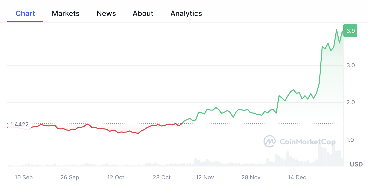
The price increase gives an already highly visible program a huge tailwind. That said, the coincidental market action will make it much harder to interpret the long-term impact of the allocations from this round.
Every project is already thinking about the next round
The distribution pattern for RetroPGF3 is pretty different than RetroPGF2. It is more of what Owocki would call a peanut butter spread rather than a power law distribution.
With a peanut butter spread, every bite is pretty good, not just the first ones.
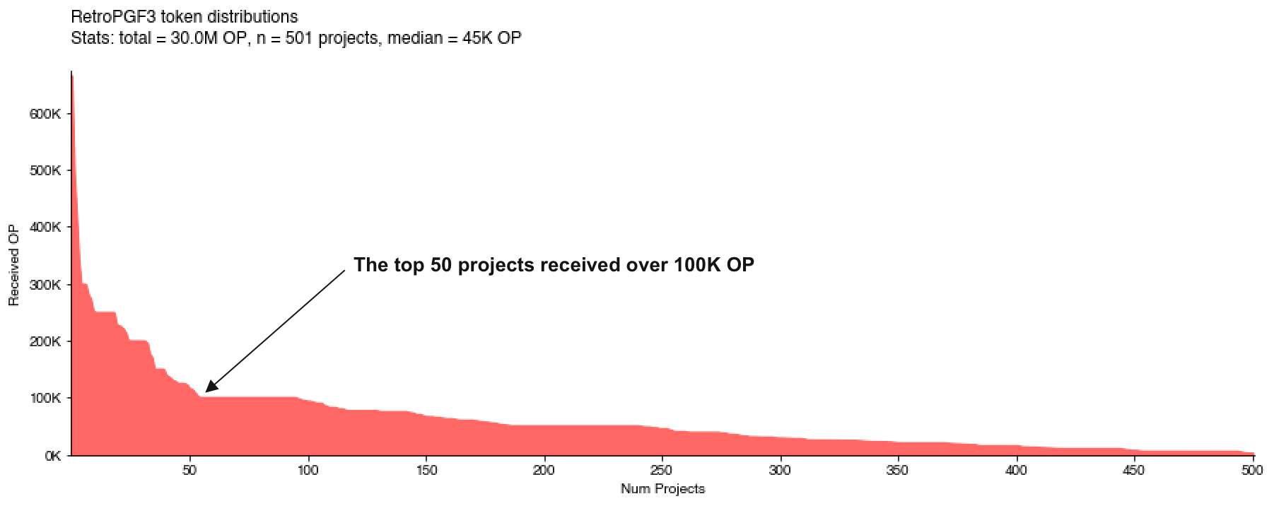
In both rounds, there were a few standouts all the way to the left of the curve (ie, Protocol Guild). However, in Round 3, there’s a clear top tier of projects that received over 100K OP followed by a long, relatively flat tail of projects after the top 50 that still received meaningful sums of money.
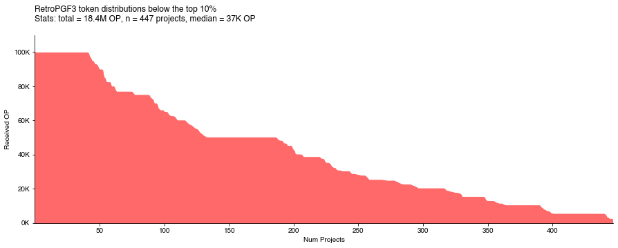
We can zoom in on the distribution below the top 10% of projects and see a lot of clustering at certain levels.
In Round 2 (below), we saw a more traditional power law distribution with a steady decay pattern all the way to the end.
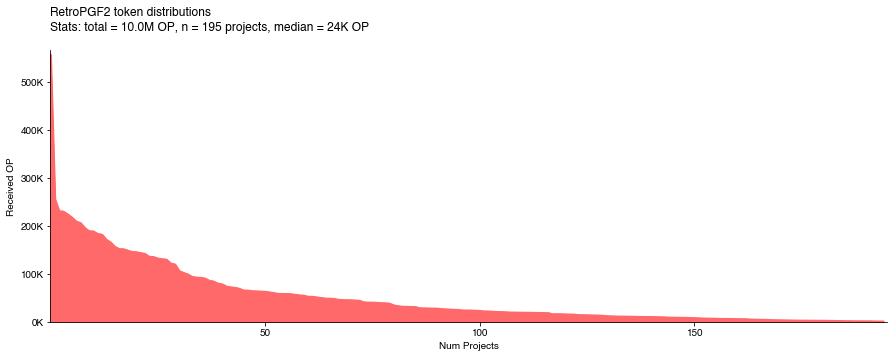
In Round 2, the median project received 24K OP, worth around $40-50K at the time. In Round 3, the median project received 45K OP, worth $175K on the day the results were announced. There’s very high upside to taking a bite.
The message many builders in the crypto universe will take away from this distribution is, “I just need to do something related to Optimism and I could earn $100K next round”. This is a massive tailwind in the sense that every talented developer who is not already deeply embedded in an existing ecosystem will be looking at Optimism now. But it will make the work of separating the signal from the noise even more important.
If you want to explore other token allocation simulations, check out this post Amy and I co-authored here. None of our simulations predicted a distribution that was this flat in the middle.
Open source software is the real winner
Projects with at least some OSS component to their work represented 50% of the applicant pool but 80% of the funding distribution.
This is extraordinary. The median OSS project received over 50K OP.
At Open Source Observer, we made a very strong push to include every project that had at least one open source repo associated with it in our dataset. Most projects included a public GitHub repo in their application, but some didn’t, so we had to track down their repo information manually (or they sent us a PR).
Although we still missed a few, a total of 315 of the 643 projects that applied for RetroPGF 3 had a profile on OSO at the time of voting. Here is the token distribution across those projects.
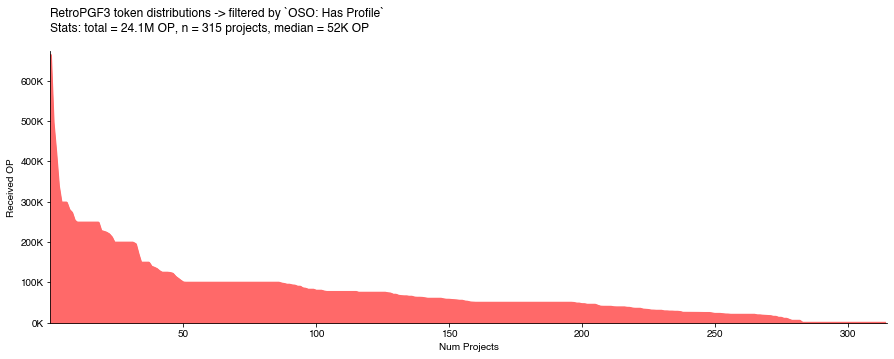
One thing that everyone should be celebrating is that RetroPGF is giving open source software projects a recurring revenue model.
I also suspect that closed source projects did rather poorly in the round. Although we don’t have the data to validate this, as an anecdote, there were at least five well-funded, closed source projects I can point to that failed to meet quorum.
I’d be negligent if I didn’t mention that open vs closed source isn’t a binary distinction. There’s a spectrum of approaches businesses take (eg, some only open source a small portion of their code) and a variety of licensing models. If there’s someone out there who wants to further deep dive on this, here’s a dataset of all the licenses for every repo we indexed during RetroPGF 3.
Despite these nuances, RetroPGF 3 should send a very strong signal to builders that open source is deeply valued.
Box seat view: the signals that badgeholders and engaged community members should pick up on
Now let’s apply this same type of distribution analysis to some more specific domains. One of the best places to look for signal is in the public artifacts that projects are leaving behind.
I constructed some MECE (mutually exclusive & collectively exhaustive) category tags for projects based on their work artifacts: GitHub repos, onchain contracts, Dune dashboards, NPM libraries, Substacks, etc. These results imply, for instance, that the Collective currently values NPM libraries more than Substacks. This is a highly imperfect method, as many projects will have impact that is observable in multiple places (eg, both on GitHub and onchain), but it’s a worthwhile starting point.
I also made umbrella tags for “Harder to Measure Contributions” that include educators, IRL events, white hats, governance contributors, and a long tail of other forms of contribution. In most cases, I also tagged whether the category applies to project (group) or individual contributions.
The tags below are only a quick first pass, but they provide some context as to the types of work domains that are more valued by the Collective.
| Category / Tag | Mean | Median | Max | Share OP | Count |
|---|---|---|---|---|---|
| OSS Project: GitHub Contributions | 75K OP | 50K OP | 664K OP | 54.2% | 216 |
| Project: Harder to Measure Contributions | 22K OP | 11K OP | 176K OP | 15.6% | 210 |
| OSS Project: OP Mainnet Contributions | 66K OP | 53K OP | 248K OP | 17.2% | 78 |
| Individual: Harder to Measure Contributions | 11K OP | 5K OP | 149K OP | 2.0% | 56 |
| Media: Substack Contributions | 10K OP | 7K OP | 38K OP | 1.1% | 31 |
| Individual: GitHub Contributions | 10K OP | 0K OP | 50K OP | 0.8% | 23 |
| OSS Project: Developer Library Contributions | 126K OP | 99K OP | 298K OP | 8.8% | 21 |
| Individual: Dune Contributions | 9K OP | 8K OP | 24K OP | 0.3% | 8 |
It would be a valuable exercise to have more people in the box seats sketch out what they think the correct distribution metrics should be for these categories / tags.
OSS Project: GitHub Contributions
This is the largest domain both in terms of OP received (over 50% of the total round) and projects. The vast majority of projects with this tag received some funding, and the median project did quite well (50K OP).
Note that OSS projects with onchain contributions on OP Mainnet and/or developer libraries are not included here. This is effectively a bundle of all of the other types of OSS contributions.
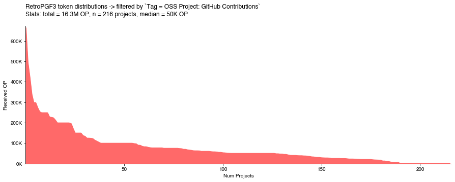
Unsurprisingly, the most prominent projects are core infrastructure and other keystones of the Ethereum and OP ecosystems. A few projects like ETH Global probably wouldn’t self-identify as OSS Projects but are nonetheless important players in the OSS space.
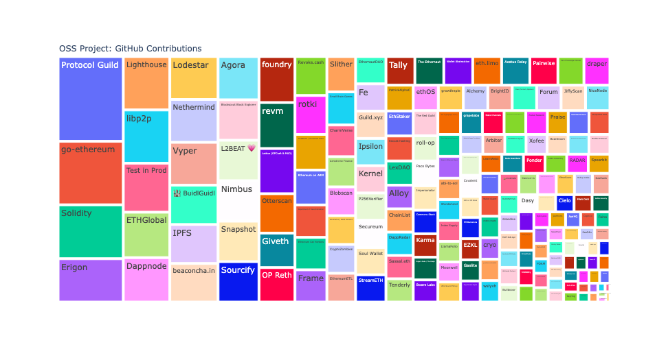
I hope talented builders see this and are inspired to become an active contributor or start their own open source project.
OSS Project: Developer Library Contributions
I was blown away by how well these projects (all of which have an NPM package) performed. To be honest, this finding gave me goosebumps and made me feel really proud to work in crypto.
https://x.com/carl_cervone/status/1745564803165262155?s=20
The distribution of funding to these projects looks like chunky peanut butter.
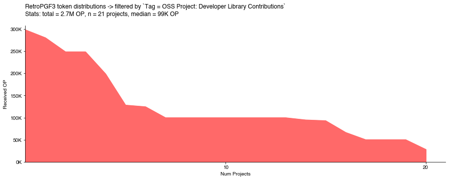
This outcome should send a very clear signal to builders: make sure your library has good support for Superchain applications.
OSS Project: OP Mainnet Contributions
On the other hand, the allocations for projects that are generating actual sequencer fees on OP Mainnet were surprisingly low.
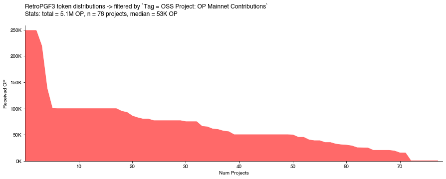
There were numerous Twitter threads pointing out that onchain projects where undervalued by voters. I think the distribution pattern confirms it. Outside the top five or so projects, the distribution is pretty flat and undifferentiated.
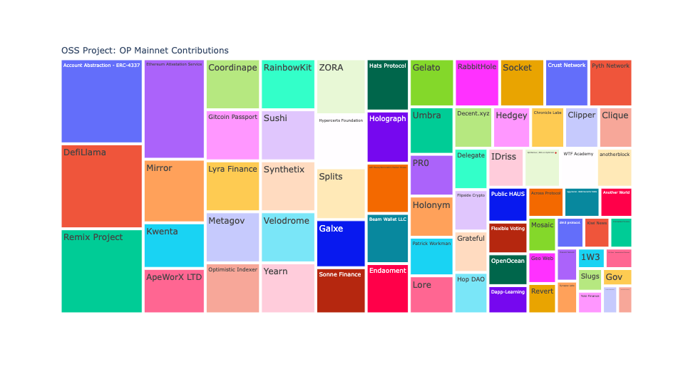
Two of the top three projects (DefiLlama and Remix) with contracts on OP Mainnet probably don’t belong in this category since their impact is much more of the general OSS flavor.
In any case, I have a hard time imagining that badgeholders, if presented with the option, would say “let’s give less than 20% of the RetroPGF pool to apps that create demand for blockspace and over 60% to tooling and infrastructure.” This high-level allocation split feels incorrect.
All the other stuff
Now let’s look at the other 20% of the funding pool that went towards 300+ non-OSS contributions. Does it make sense to invest that much of the funding pool into these areas? (FWIW, in my own voting strategy, I thought the answer was yes.)
We’ll start with some of the easier categories: Substacks and Dune Wizards.
Both categories have more of a standard distribution pattern, not a power function or a peanut butter spread. It was harder for these contributions to make quorum. There weren’t any outsized favorites either.
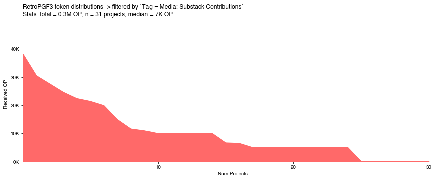
Again, remember that these categories are mutually exclusive, so a project with work happening in a public GitHub repo and a Substack would not appear in the distribution above.
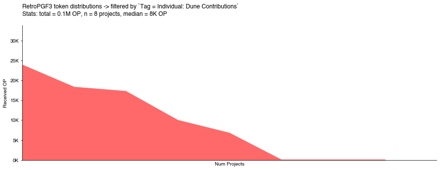
It’s also encouraging seeing a cohort of Dune data wizards getting recognized for their contributions.
Maybe one day we’ll see Dune and Substack become contributors to the RetroPGF pool or even stand up their own funding pools!
Other pathways for individuals having impact that is rewarded by the Collective are harder to measure and most likely harder for builders to replicate. The chart below shows the distribution of OP that went to 50+ individual applications for a variety of contribution types.
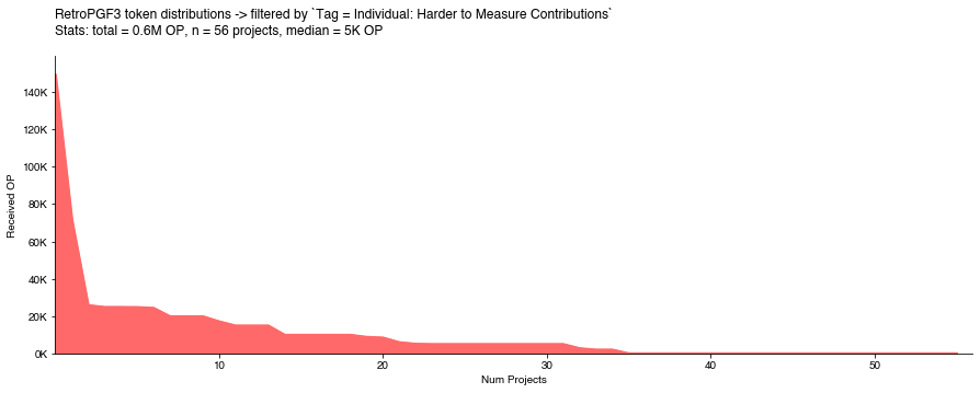
ZachXBT and Polynya need no introduction and represent the two outliers all the way to the left of the curve. Beyond that, there isn’t a whole lot of signal apart from the fact this is the one category where nearly half of the applicants failed to make quorum.
This isn’t that surprising because this category includes everything from people doing on-the-ground work in a specific region of the world to researchers in niche subject matter areas. My sense is that badgeholders are like fish out of water trying to evaluate these types of contributors holistically.
If these forms of contribution are to be rewarded through RetroPGF, it probably makes sense to stand up mini-rounds with oversight from people who have more context into specific impact domains than the average badgeholder.
Last but not least, we also have projects that had harder to measure contributions. This is a real motley crew. It included software projects like Gitcoin and Rainbow Wallet that had overlapping impact claims (Gitcoin Passport was included in the onchain category and Rainbow Kit was included in the developer libraries category), a few closed-source projects building on Optimism like BasePaint and Layer3, and a few that didn’t include GitHub links in their applications and we missed in our follow-up coverage (eg, ImmuneFi, Conduit … sorry!).
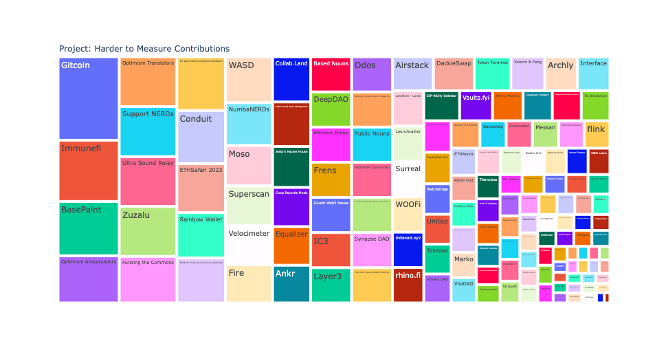
However, the majority of projects in this category are much harder to classify. They include teams of OP contributors like the Optimism Ambassadors and Translators. IRL events like Zuzalu and ETHSafari. A variety of DAOs, NFT communities, Nouns forks. There are some up-and-coming consumer apps that haven’t open sourced. As the British say, it’s a real dog’s breakfast.

A more diligent analyst could probably subdivide these projects into dozens of categories.
However, the thing I care about is separating the signal from the noise. For the average badgeholder, it was very difficult to mine this long tail of projects for hidden gems unless you knew about them already or they showed up in your DMs.
If we want to avoid a popularity or Keynesian beauty contest, we have to do better here. I would argue that rounds of RetroPGF in their current configuration (uncapped project set, capped voter set, undefined metric set) are not a great mechanism for identifying long tail public goods. Better curating or breaking up into smaller rounds “all the other stuff” feels essential for future rounds.
Projects vs individuals
In addition to the incentive for everyone to throw their name in the hat next RetroPGF, there may also be a perverse incentive for individual contributors or factions from within larger projects or DAOs to apply.
If there were a peanut butter spread across every full-time developer in the ecosystem, then you’d see every developer receiving around 28K OP. If the voting mechanisms determined that larger teams had super-linear impact, then a top project with a big team like Protocol Guild would probably be receive well over 1M OP. Instead, the distribution appears to favor smaller teams.

A number of smaller teams received well over 50K OP per active developer whereas none of the medium to larger teams receive anything close to this.
Even if we believe that impact should be evaluated independent of the team size or composition, the Collective most likely doesn’t want to incentivize projects to fractionalize their contributions into separate applications.
This isn’t a new phenomenon; I wrote about the same thing after RetroPGF 2.
In the arena view: signals that live players and builders should pick up on
As a badgeholder, I used Open Source Observer to experiment with a variety of metrics-driven Lists. (You can see a full list of Lists and a retro on how they performed here.)
The intention was to start identifying a set of broadly applicable impact metrics that give builders a sense of where to focus. If one goal is to generate sequencer revenues, then you’d expect a project generating a lot of sequencer revenues to receive more RetroPGF than one that isn’t. If another goal is to onboard and retain new developers to the ecosystem, then you’d expect a project with high developer growth and low developer churn to perform better than a project run by a single person who has been at it since 2014.
These metrics need not be deterministic, but they should be reasonably predictive.
We called these types of metrics “Impact Vectors”.
An impact vector is a direction of positive impact that projects in the Optimism ecosystem should work towards. More concretely, each vector represents:
- a quantitative impact metric (eg, a project’s contribution to sequencer fees)
- measured over a discrete period of time (eg, the last 6 months)
- normalized across a distribution of relevant projects in the ecosystem (eg, all projects with onchain deployments)
This method explicitly seeks to identify positive outliers, ie, the signal, in an otherwise noisy distribution.
It’s very cool to see some of this thinking taking shape in the form of an impact calculator for future rounds!
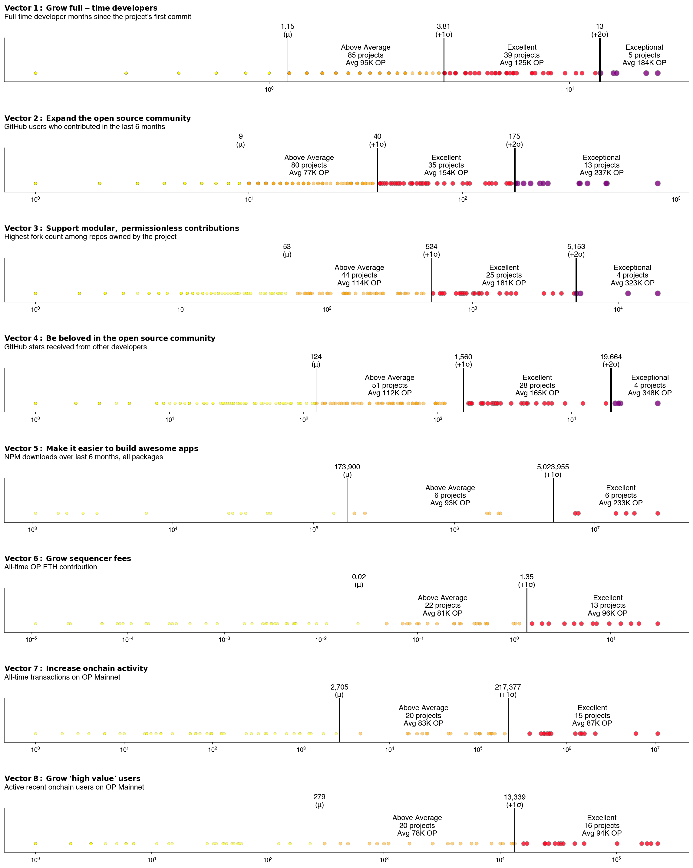
In the meantime, we can look at my V1 impact vectors and see how the “excellent” and “exceptional” projects performed relative to their peers. Warning: there a lot of data in this chart.
Weak signals
As brought up early, the impact vector that was least predictive in terms of RetroPGF rewards was onchain activity. Projects that a transaction count of more than 1 standard deviation from the mean (ie, over 200K transactions) received on average 87K OP vs projects that were within 0-1 standard deviations received 83K OP.
In fact, all metrics related to onchain activity were weak predictors of token distributions, with a spread of only 15K OP between “above average” (0-1 stdevs) and “excellent” (>1 stdevs) performers along this vector.
Perhaps badgeholders aren’t active users of these types of apps or think they have already received “profit” from elsewhere in the value chain. But I would expect the next round of RetroPGF to correct for this.
Lukewarm signals
Team size, both in terms of active developers and overall contributors, were lukewarm impact vectors. It’s common for ecosystems to explicitly state that they want to attract new developers, so this observation should be explored more deeply. The trend that contributors on smaller teams tended to receive proportionally more RetroPGF is also relevant here.
However, badgeholders tended to reward projects that had steady, well-established teams more generously than up-and-coming ones.
I would expect this balance to shift over time. Some experimentation is needed, but it should be possible to define vectors that reward projects that onboard new developers who stick around in the ecosystem.
Strong signals
The strongest predictors of RetroPGF distributions for OSS projects were … drum roll please … NPM downloads. You can read our critique of downloads as a metric and a proposal for three better metrics for developer libraries here.
Stars and forks were also pretty strong signals. The chart below shows the average OP reward for excellent and exceptional projects for any given impact vector.
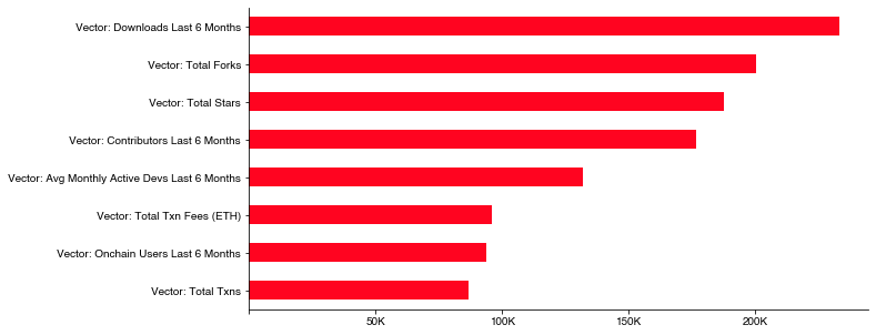
However, it reveals a simple truth that it was easy for badgeholders to achieve consensus on who the well-known OSS projects in the Ethereum and, to a lesser extent, Optimism ecosystems are. And they allocated large token amounts to those projects.
If that’s the intended outcome, great. These are amazing projects. Although we probably don’t need all this governance and complex voting to achieve it.
Finding new signals
If it were easy and all we had to do was figure out how to count GitHub stars, then this whole economic and governance experiment wouldn’t matter. But it does matter. And it won’t be easy.
We need to level up the game and find new signals for the players.
That’s the Optimism Collective’s primary objective between now and the start of RetroPGF 4.
If you’re interested in working on this problem directly or helping shape the research dialogue around measuring open source impact, please reach out.
You can explore and fork my analysis here.
