Impact pools on Arbitrum: identifying projects that are driving ecosystem growth
In our last post, we provided a snapshot on the open source software projects building on Arbitrum. In this post, we will apply a series of experimental impact metrics to identify positive growth and network contribution trends across a cohort of more than 300 major projects on Arbitrum.
We believe impact metrics such as these are instrumental in helping the Arbitrum DAO better design incentives and allocate capital across its ecosystem. The metrics we've included are all derived from both onchain and off-chain project data. They include well-established crypto indicators like active users, sequencer fees, and transaction counts as well as common OSS metrics like full-time active developers, issues closed, and new contributors.
The real value, however, lies in combining simple metrics in novel ways to filter and benchmark projects' contributions. We introduce four "impact pools" that can assist with this type of analysis. The pools are:
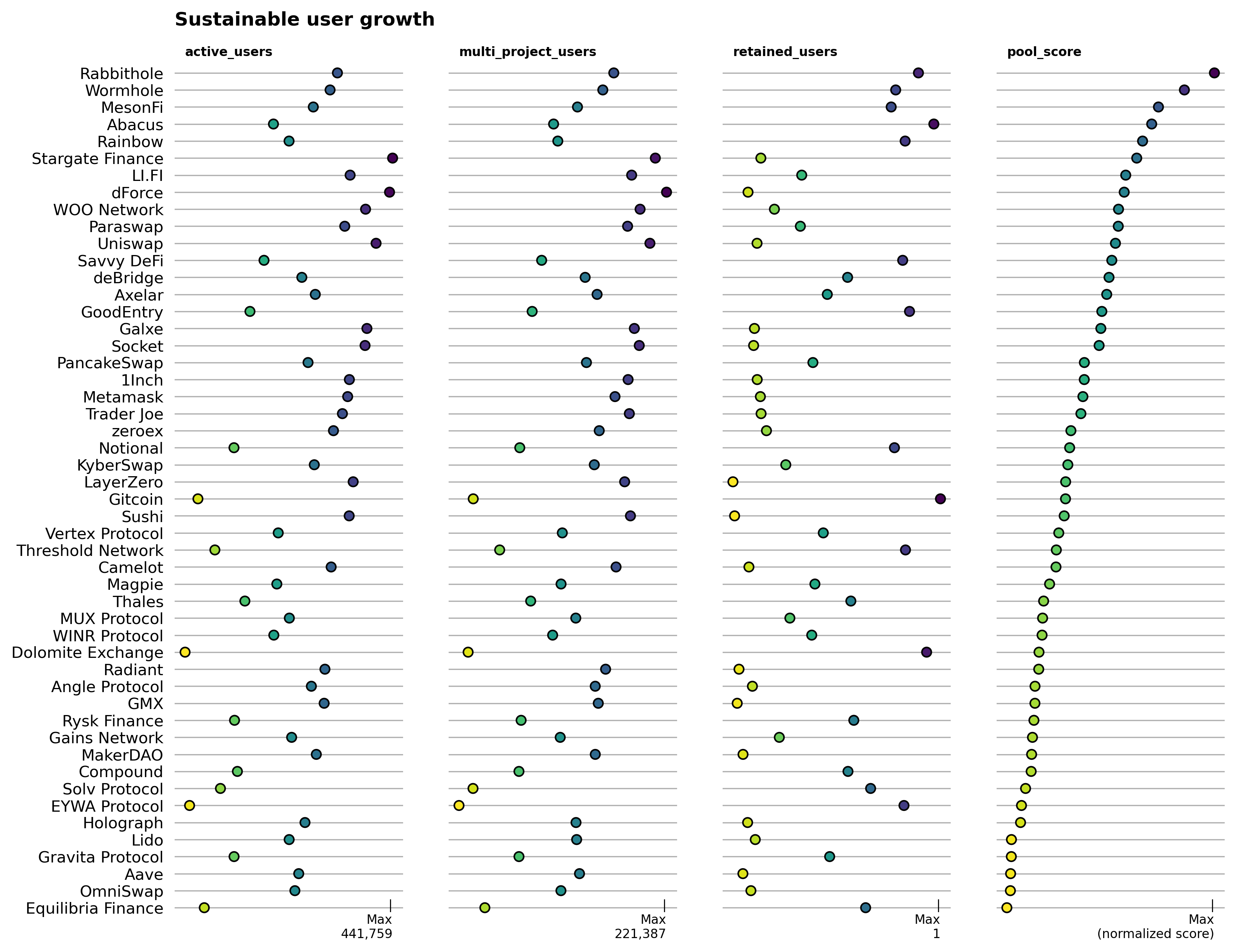
- Sustainable user growth: projects that not only bring large numbers of active users to the network but also retain and connect them easily to other dapps
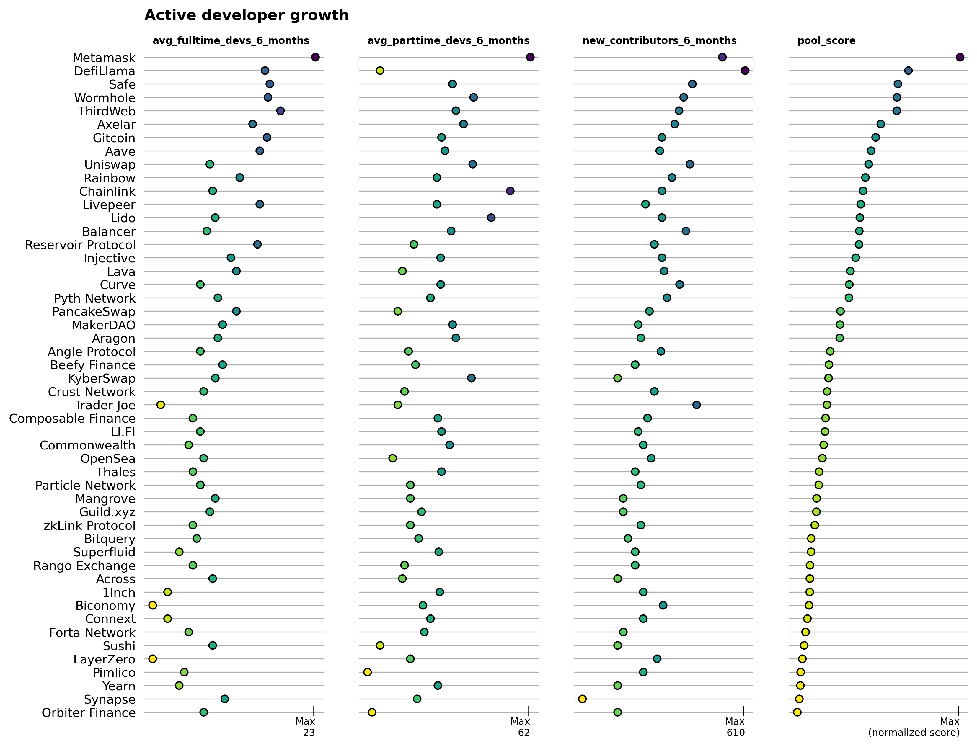
- Developer growth: projects with the most developer activity and new contributors to its GitHub repos in recent months
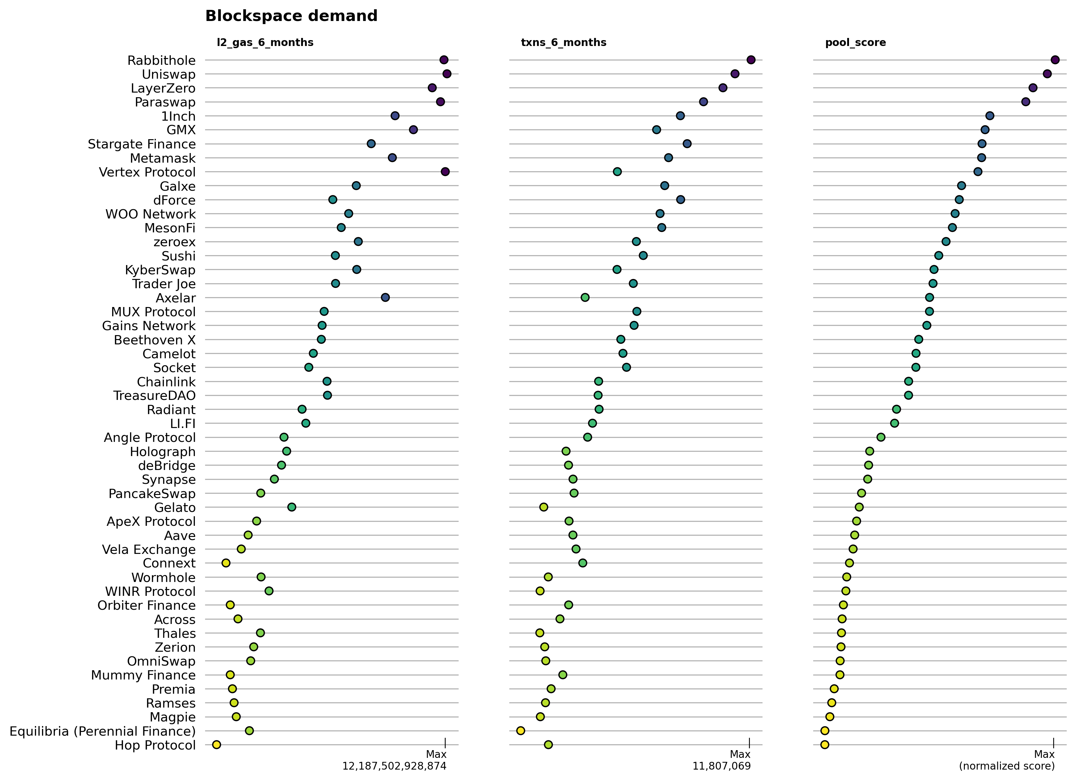
- Blockspace demand: projects with the most transactions and sequencer fee contributions
- Momentum: projects with a mix of positive developer and onchain user trends
As described in our previous post, these projects were sourced primarily from the most recent “Electric Capital Crypto Ecosystems Mapping”, from Dune Analytics, and from Plurality Labs partners including Karma GAP and OpenBlock Labs. We invite your contributions to enhance this directory; please visit here to submit a PR or here to learn more about how to contribute data about projects and their code artifacts.
A word of caution
Before getting into the numbers, we want to flag that this work is experimental in at least two ways.
First, our data platform is still in active development. We just recently connected sources of onchain data for projects building on Arbitrum to our existing data warehouse of open source software development metrics. There are still some kinks we are ironing out and as result it's likely that some projects, contract addresses, and other types of data slipped through the cracks. Please let us know if you find any gaps or inconsistencies with the data.
Second, we are continuously iterating on our impact metrics. We hope the metrics included here illustrate what's possible to quickly identify trends among projects and relative performance levels. However, the metrics we chose should not be viewed as applicable to all projects or battle-tested against gamification. Similarly, the coefficients used to weight metrics in our impact pools are only intended to serve as starting points for further analysis.
If you have ideas for how to test and iterate on these types of impact metrics and pools, check out our docs and send us a note.
How pools are constructed
An impact pool is essentially a weighted portfolio of projects based on multiple impact metrics. For instance, the blockspace demand pool considers transaction counts and sequencer fee contributions and weights these metrics 50/50. Thus, a project at the top of the impact pool is usually one that performs well on both indicators.
The general process for constructing an impact pool consists of four steps. First, we select relevant project metrics (eg, multi_project_users). Next, we apply a set of eligibility filters to determine which projects should be considered. For this exercise, the only filter we use is a date filter to ignore projects that started less than 6 months ago. Then, we apply a model for normalizing the data into a continuous distribution. We kept things simple here too, keeping every indicator on either a standard normal or a lognormal distribution. Finally, we applied a weighting coefficient to each metric's distribution function to determine how heavily it should be weighted in the pool.
Available impact metrics
Each pool is constructed from a series of relevant impact metrics that have been aggregated for each project (as of February 28, 2024).
Using Uniswap as an example, these indicators include:
project_name                                            Uniswap
first_commit_date                2018-03-07 21:59:23.000000 UTC
last_commit_date                 2024-02-27 04:25:00.000000 UTC
repos                                                      58.0
stars                                                   26540.0
forks                                                   24545.0
contributors                                             1061.0
contributors_6_months                                     123.0
new_contributors_6_months                                  69.0
avg_fulltime_devs_6_months                                  3.0
avg_active_devs_6_months                              19.666667
commits_6_months                                          659.0
issues_opened_6_months                                    468.0
issues_closed_6_months                                    111.0
pull_requests_opened_6_months                             990.0
pull_requests_merged_6_months                             673.0
num_contracts                                             187.0
first_txn_date                                       2021-08-01
total_txns                                           36432885.0
total_l2_gas                                   45079433321289.0
total_users                                           1350355.0
txns_6_months                                         8427926.0
l2_gas_6_months                                12187502928874.0
users_6_months                                         452206.0
new_user_count                                         131403.0
active_users                                           258476.0
high_frequency_users                                      140.0
more_active_users                                       47828.0
less_active_users                                      210508.0
multi_project_users                                    132928.0
retained_users                                         0.191413
Filtering eligible projects
The filters used in this post are pretty basic. We filter any project that had its first (public) contribution after 2023-09-01, ie, less than 6 months from the time of writing. We also limit our pools to just the top 50 projects, which obviates the need for additional filtering.
In future iterations, more sophisticated filtering is recommendeded to ensure a higher level of quality control. For instance, we may only want to consider GitHub repos that have been starred by a Top 100 developer in the Arbitrum ecosystem.
Normalizing the data
The first two steps give us a vector of projects and values for each impact metric. Now, we need to transform the data into a normal distribution that allows us to compare projects' relative performance.
For this report, we chose to plot most indicators on a lognormal distribution. The only indicators that had a standard normal distribution were related to developer counts and user retention.
Weighting metrics in the pool
Finally, we applied a weighting coefficient to each metric's distribution function to determine how heavily it should be weighted in the pool. These can be viewed in the Python notebook that accompanies this report as statements like the following:
blockspace_pool = create_impact_pool(
    df[df['first_txn_date'] < DATE_FILTER],
    impact_vectors={
        'l2_gas_6_months': ('log', .5),
        'txns_6_months': ('log', .5)
    }
)
The example above has a weighting of 50/50 for two vectors related to blockspace (gas fees and transactions counts).
You can explore the Python notebook and the static data used for this report here.
Impact pools
Now let's take a look at the four impact pools we generated.
Sustainable user growth
This pool considers projects that not only bring large numbers of active users to the network but also retain and connect them easily to other dapps. It's configured as:
users_pool = create_impact_pool(
    df[df['first_txn_date'] < DATE_FILTER],
    impact_vectors={
        'active_users': ('log', .5),
        'multi_project_users': ('log', .25),
        'retained_users': ('linear', .25)
    }
)
Rabbithole is currently the top performing project in this pool, with high levels across all three major impact metrics (active users, multi-project users, and retained users). Rabbithole's Quests product is aimed at onboarding new users by encouraging them to interact with other dapps on the network, so the retained user numbers are probably more helpful to track over time than the multi-project users.
We are also in discussion with several partners about integrating address reputation metrics to further differentiate users on the basis of quality and uniqueness.
If we zoom on two of the three metrics that comprise this pool - active users and retained users - it becomes easier to spot a cluster of currently high preforming projects in the upper right corner of the chart. As projects become larger and more mature, growing beyond the 100K active users mark, then a retention rate of ~40% like LI.FI's appears to be the benchmark to beat.

Developer growth
This pool highlights projects with the most developer activity and new contributors to its GitHub repos in recent months. It's configured as:
dev_growth_pool = create_impact_pool(
    df[df['first_commit_date'] < DATE_FILTER],
    impact_vectors={
        'avg_fulltime_devs_6_months': ('log', .5),
        'avg_parttime_devs_6_months': ('log', .2),
        'new_contributors_6_months': ('log', .3)
    }
)
The top performing projects in terms of developer growth are mostly if not all well-established projects with large treasuries. MetaMask, DefiLlama, and Safe are some of the largest open source software teams in the Ethereum ecosystem, but not specific to Arbitrum. Further analysis can be done to hone in on projects that have concentrated their building activities on Arbitrum vs other chains. You have to look pretty far down the list to identify Arbitrum-native projects.
The scatter plot below helps differentiate projects that have large community contributors (such as DefiLlama) vs projects that have a large core team of full time time developers (such as Livepeer). Once again, it would be valuable to focus this analysis on Arbitrum-specific projects and niches.

Blockspace demand
This pool features the projects with the most transactions and sequencer fee contributions. It's configured as:
blockspace_pool = create_impact_pool(
    df[df['first_txn_date'] < DATE_FILTER],
    impact_vectors={
        'l2_gas_6_months': ('log', .5),
        'txns_6_months': ('log', .5)
    }
)
Rabbithole is once again the leader of this group, followed by a number of DeFi and crosschain messaging protocols. GMX and Vertex Protocol stand out as Arbitrum-native exchanges with high impact on these dimensions.
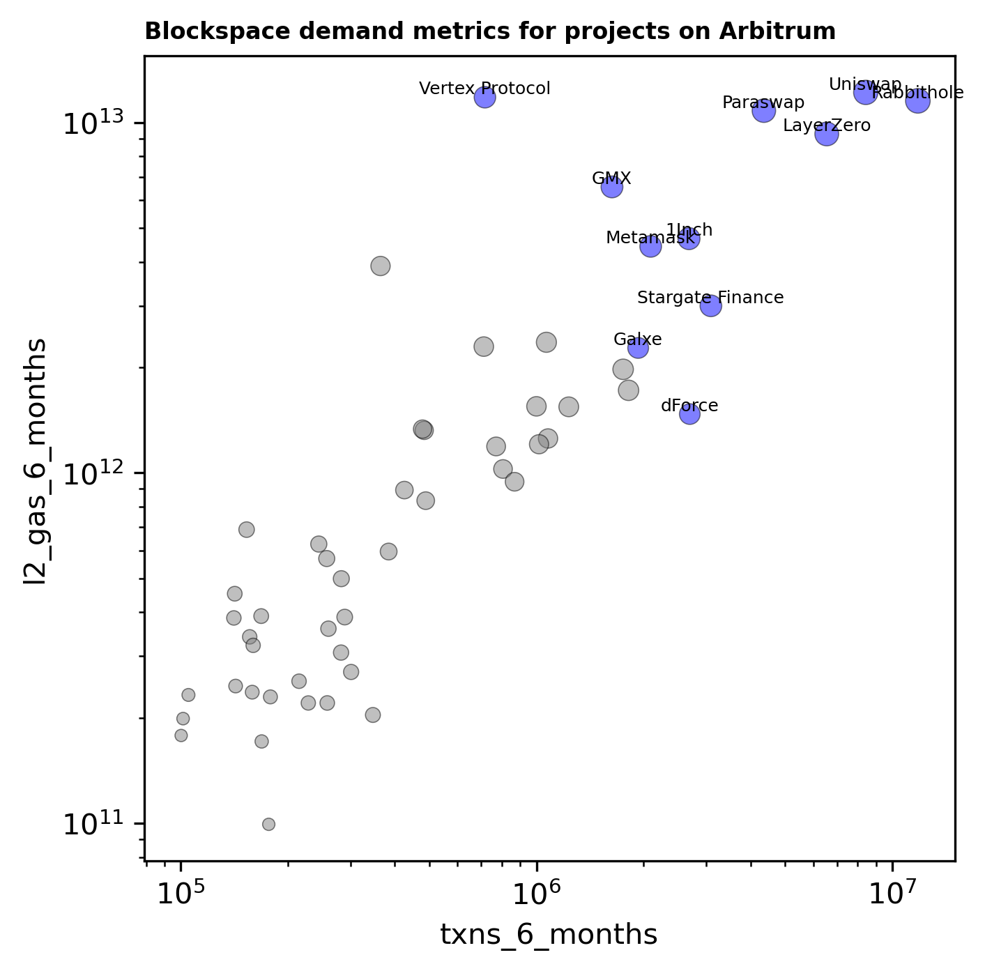
The scatter plot below provides some indication of transaction efficiency, although there are likely some confounding factors. We see projects like Vertex being a proportionally high generator of sequencer fees whereas dForce is at the other end of the spectrum.
Momentum
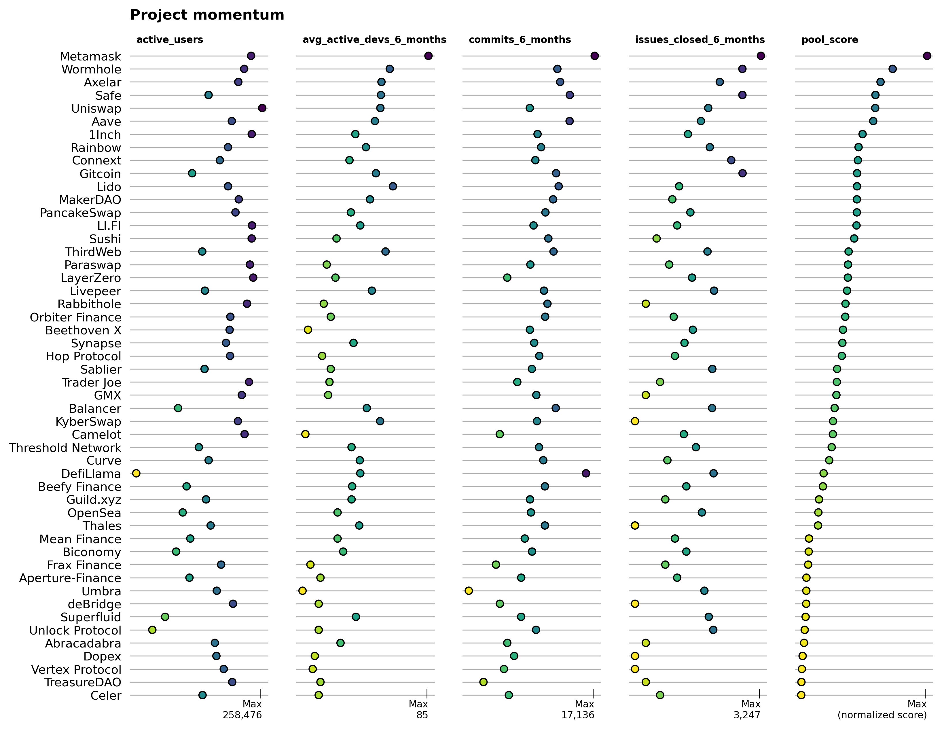
This pool is the most experimental and benchmarks projects against a mix of positive developer and onchain user trends. It's configured as:
momentum_pool = create_impact_pool(
    df[df['first_txn_date'] < DATE_FILTER],
    impact_vectors={
        'active_users': ('log', 1/3),
        'avg_active_devs_6_months': ('log', 1/6),
        'commits_6_months': ('log', 1/3),
        'issues_closed_6_months': ('log', 1/6)
    }
)
Over time, it is important for Arbitrum to grow both developer and user numbers. The momentum pool captures these metrics directly. Metamask is the leader, although few in the industry would probably view it as a fast mover. Perhaps a better name for this pool would be "clout" and momentum could be tracked between snapshots in time.
In any case, Rainbow and Gitcoin are among the top projects, with high-ish scores across all four metrics. DeFi and interoperability protocols are also well-represented in this pool.
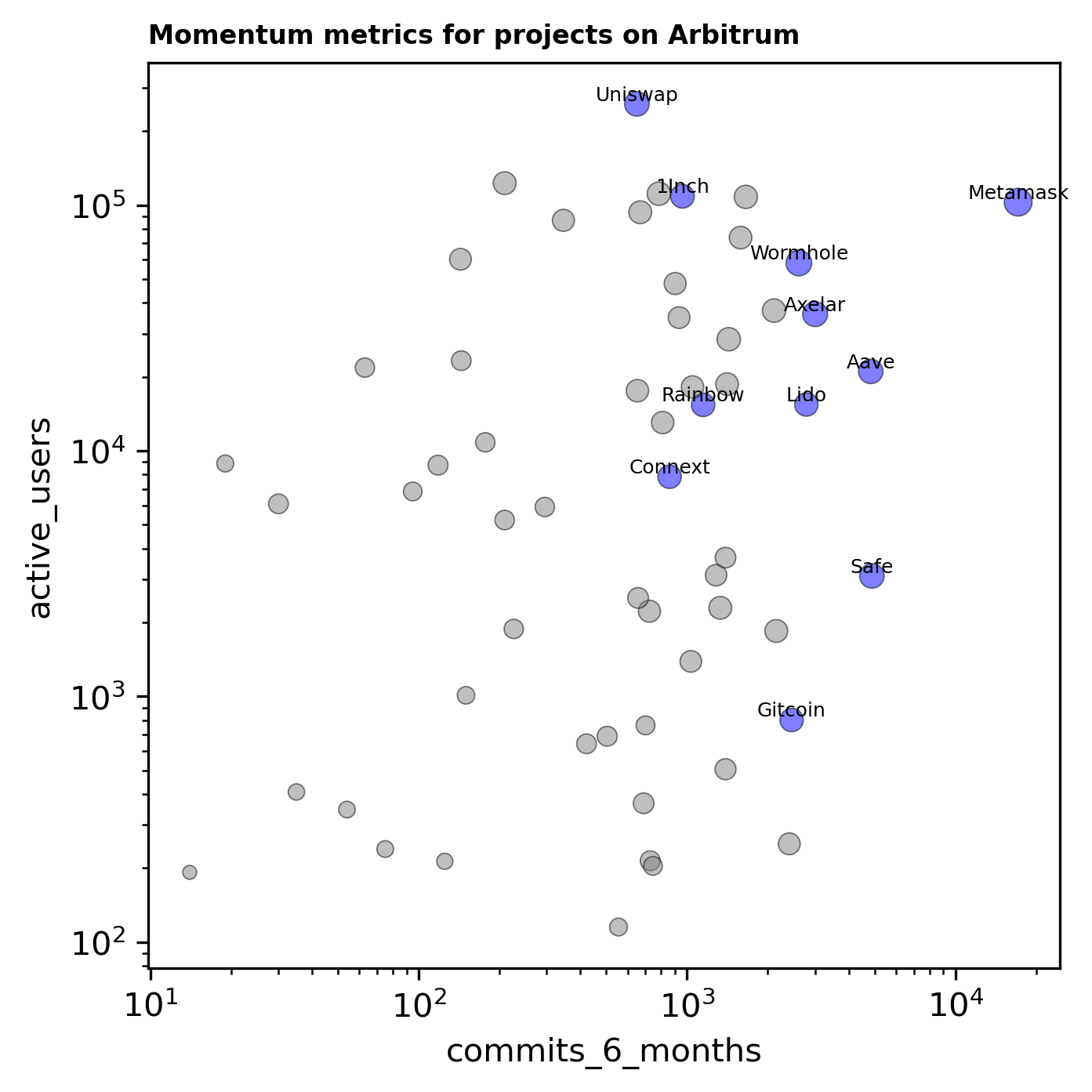
As shown in the plot below, there is no strong relationship between active users and commits. This is an important observation to bear in mind and we seek to go from capturing lagging indicators (like retained users and full-time developers) to ones that are more predictive of future growth and impact.
Final thoughts
At Open Source Observer, we are excited about putting the ability to do this type of analysis in the hands of as many citizen analysts and data scientists as possible. We share these four impact pools as inspiration for what becomes possible when you have well-labeled data that's easy to query.
We are seeking to grow a community of "impact data scientists" who can contribute directly to this type of analytical work and use it to improve capital allocation decisions. If you'd like to contribute to this mission, then we invite you to join our data collective.
We will also be re-launching our public dashboarding interface for projects and collections of projects on opensource.observer soon!
