OSO's Architecture Evolution
Over 2024, OSO's technical architecture went through several major iterations to get to where it is now. There are so many different ways to architect data infrastructure, that the choices can be overwhelming. Every platform will say they provide what you think you need, and none of them will do everything you actually need. In this post, we'll share the choices that OSO made along the way and the pros and cons of each decision.
Phase 1: A simple indexer
When we first started in late 2023, we had a short period of time to get data together in time for our first big partnership, Optimism retro funding 3. OSO's goal is to measure the impact of software in digital economies. The first 2 datasets we would need to do that were GitHub data (to see developer activity) and blockchain data (to monitor end-user activity).
We took inspiration from how many indexers are built, from The Graph and DefiLlama on the blockchain data side, to Augur and Grimoire on the GitHub data side.
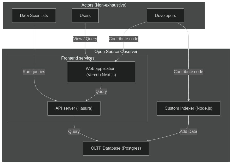
In this architecture, we ran a simple Node.js web server backed by a Postgres database. We tried to use as much free infrastructure as we could, including the Vercel and Supabase free tiers. We also wrapped the data fetching logic in a Node.js CLI, so that we could run jobs from GitHub actions to take advantage of the free compute minutes available to open source projects. One of the cool technologies that we discovered at this time was Hasura, which automatically turned any Postgres database into a GraphQL API. Eventually, we replaced Postgres with Timescale in order to more efficiently store and query time series events.
Pros
- Simple and fast to build
- Low operational costs (free)
- Leverage the rich web development ecosystem
Cons
- Inflexible and difficult to do data science
- Lots of custom code to scrape APIs
- Difficult to trace data quality issues
The problem with the initial architecture was that we both aggregated too much, and too little to be effective. We quickly outgrew simple aggregations and wanted to run more sophisticated queries, which would not perform well at request time. Any time we wanted to introduce a new metric, it required a large amount of engineering work and reindexing all of the data.
For example, we wanted to count the number of distinct active developers across all repos in a project. When we first started, we bucketed events by day to be storage efficient, which lost the data fidelity needed to compute something like this. We learned the hard way, as countless others before us, that ETL processes are not great for data science. It was time to transition to an ELT process.
Phase 2: Adding dbt and BigQuery
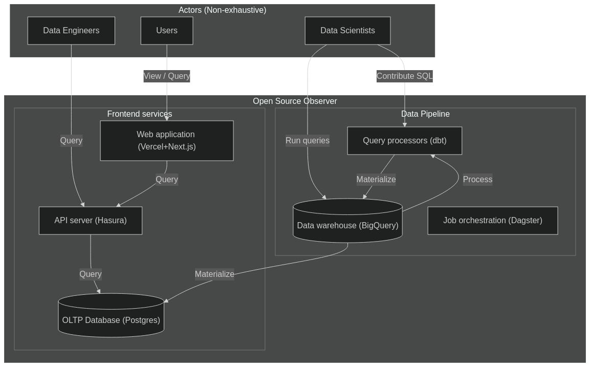
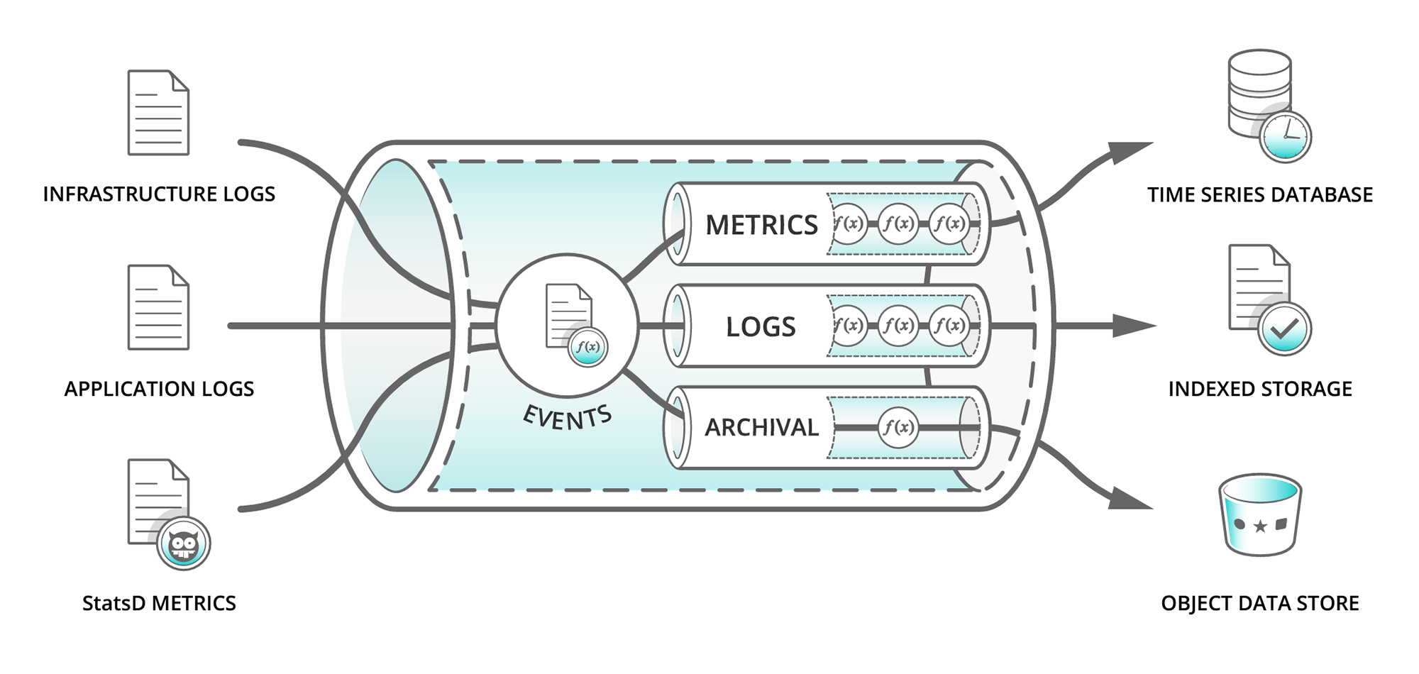
Enter data warehouses, like Snowflake, Databricks, and BigQuery. By storing all of the raw source data in a data warehouse, it makes it trivial to dynamically run any arbitrary queries on top. We can define a sequences of transformations in our data pipeline. We chose dbt at the time, which is still considered best-in-class for this workload. If we changed any data model, the pipeline should be smart enough to only recompute models downstream from it. It was also smart enough to incrementally run models on fresh data.
We also decided to build on top of Google BigQuery, which already had the 2 main public datasets we needed at the time for free, GitHub and Optimism blockchain data. It was also the only major data warehouse that supported retail users. Anyone with a Google account could query the raw data or our data models, up to 1TB for free every month. As a first-stage filter, we would filter down the raw data sources to just the relevant events for a small subset of projects. Then, we'd normalize everything in our own semantic model of artifacts, projects, collections, and events. Metrics were then computed against a universal event table, each represented by its own data model.
Pros
- Simple and low setup costs
- Leverage the rich public data ecosystem of BigQuery
- Easily share data with any Google user
- Integrates easily with Kaggle
Cons
- Very high computation costs
- Proprietary technical stack
- Jinja macros
We'll address the cons later. For now, this was a huge step up in our ability to experiment with different data models. At the end of the pipeline, we materialized our mart models into the same Postgres database for serving the API.
Phase 3: Replacing GitHub actions with Dagster
At this point, we were still using GitHub actions to orchestrate all of our data jobs. The problem here was when things went wrong (which happened a lot), it was very difficult to find the exact failure in the logs. It was also difficult to tell how fresh any particular data model was, and we had no capacity to materialize a single model. Instead, we only had 1 job that would run the entire pipeline.
By this time, we were racing to get metrics ready for Optimism retro funding 4, the first time our metrics would directly impact the flow of funding. Debugging a stable pipeline was the top priority. We were also partnering with Goldsky to ingest our own blockchain traces from 7 networks in the Superchain, releasing them as a public dataset.
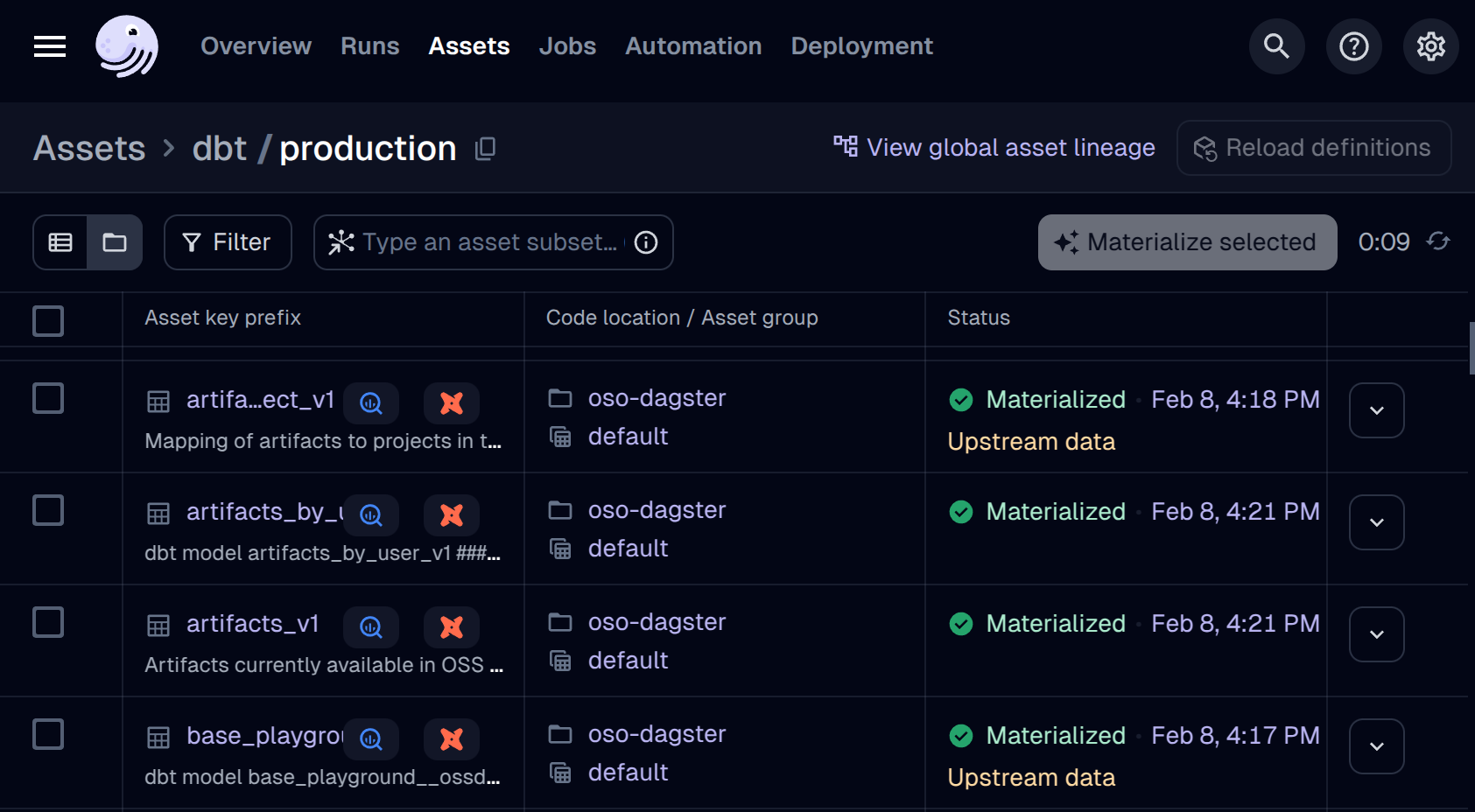
In order to facilitate better debugging, we moved all of our data orchestration to Dagster, which allowed us to visualize the entire data pipeline, monitor data jobs, data freshness, and debug individual failing models.
Phase 4: Replacing Postgres with Clickhouse
By this point, our metrics were derived from over 50TB+ of raw data.
Even the mart models being served from the API were over 100GB+ in size.
The Postgres database we used for serving was struggling to keep up with queries,
even with basic lookups.
The breaking point came when the job to create indices kept failing
for our larger tables (e.g. artifacts_by_project_v1).
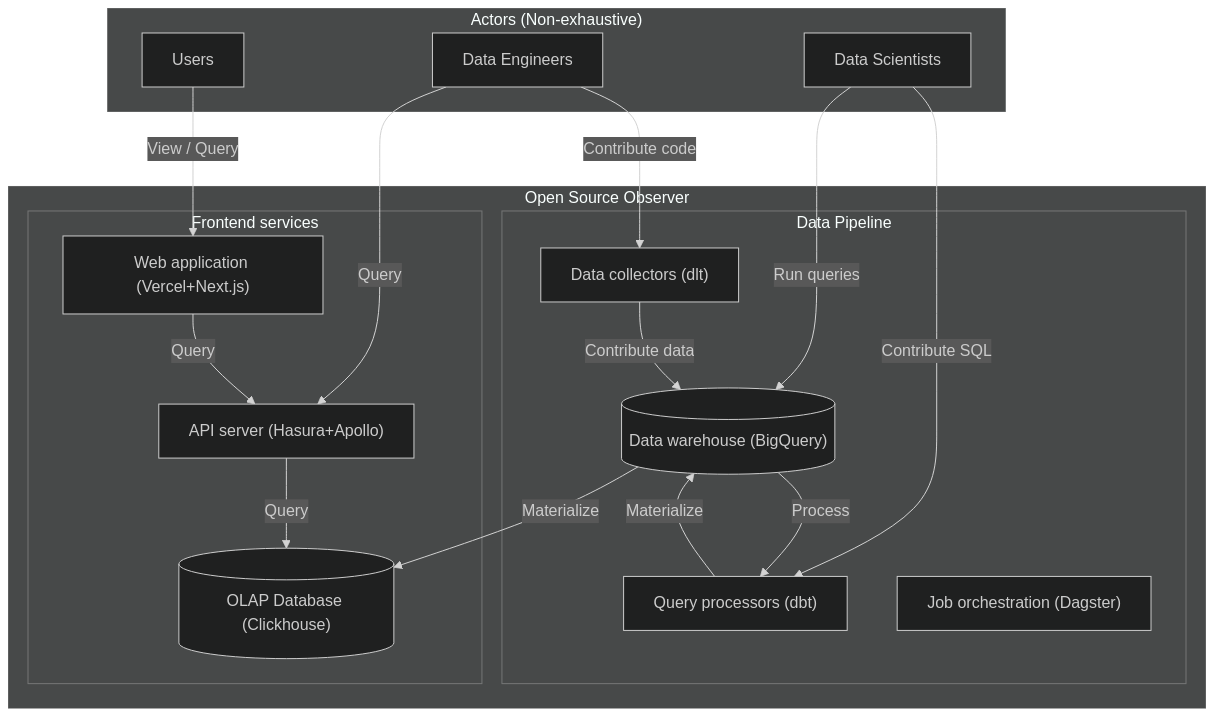
We originally chose Postgres as the safe, most common option, but it was increasingly clear its limitations as a OLTP database. We wanted to switch to an OLAP database, optimized for analytics queries. After evaluating some options, we ended up choosing Clickhouse, which has built a reputation for low-latency snappy analytics queries, suitable for frontends.
Phase 5: Replacing custom indexing with dlt
We quickly outgrew what we could do with just the available public datasets. Beyond establishing our own ELT ingest for Superchain data, we also needed to ingest Farcaster, Gitcoin, OpenRank, and EAS data.
We evaluated a number of different data movement tools, with very limited success, including: Airbyte, CloudQuery, Meltano, BigQuery Data Transfer Service. Sometimes, we wanted to replicate an existing dataset from S3 or Postgres. Sometimes, we wanted to crawl an API, which could be REST or GraphQL. Often times these different solutions would fail for a variety of reasons.
With the new Dagster setup, we decided to just stick with Dagster embedded-elt, which has built-in support for dlt. It has satisfied every use case we've had so far, and we've never looked back.
Phase 5: Running sqlmesh on Clickhouse
Around August 2024, we hit a major roadblock with dbt and BigQuery. Up until now, we were just computing metrics at the current date (e.g. new active contributors to a project within the last 6 months). What if we wanted to see the full time series of any metric for any period of time? This would be incredibly powerful, not just to show time-series graphs in a dashboard. It would be the fundamental underpinning of any causal inference analysis to understand whether any funding system is driving real outcomes.
In order to calculate time-series metrics, we evaluated a number of metric semantic layers, including Cube and MetricFlow. However neither supported what we thought was the simplest tablestakes metric: "How many unique active users/developers churned between any 2 months?"
In order to perform this query, we'd need to mark each unique user/developer by their activity in a 30-day rolling window. Then we'd aggregate by artifact/project/collection, the number of unique users/developers in a 30-day rolling window. Then we'd compare 2 subsequent months in a rolling window to determine the changes (churn).
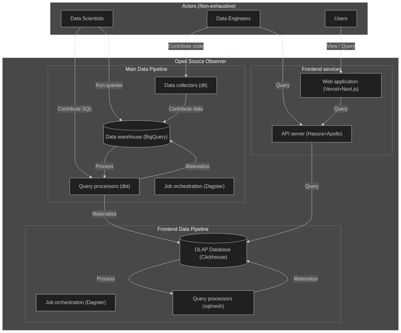
Instead, we ended up writing our own semantic layer metrics factory on top of sqlmesh. sqlmesh is a drop-in replacement for dbt, with a number of additional powerful features, including Python macros (bye bye Jinja), automatic translation between SQL dialects, and the ability to auto-matically generate new models using Python. These features were the fundamental unlock that enabled us to build our own semantic layer and metrics system. We built so much on the bleeding edge of metrics that the team behind sqlmesh invited us to speak at their annual Tobiko conference.
Our initial experiments ran the metrics pipeline on a separate Clickhouse cluster, so that we could continue supporting the existing mature dbt/BigQuery pipeline. The experiment convinced us of 2 things:
- sqlmesh is the future of data transformation
- Clickhouse is great for serving, but its lack of fast deletes and its eventually consistent nature were not a good fit for sqlmesh
Phase 6: Replacing dbt/BigQuery with sqlmesh/Trino/Iceberg
By now we were committed to fully transitioning our entire pipeline to sqlmesh. However, our cloud bills were becoming astronomical. On certain days when we ran a full pipeline refresh, our 1-day cloud bill would be >$1000. We needed to find a more cost-effective and scalable solution.
We decided to rip off the band-aid and do a major transition to an auto-scaling Trino cluster while transitioning to sqlmesh. We'd hit 3 birds with 1 stone: decentralizing our infra, supporting time-series metrics on sqlmesh, and reducing our cloud costs all in 1 go, at the cost of instability for a few months.
After a painful Q1, we are excited to share the results of this refactor:
- We run all of our queries on an auto-scaling Trino cluster of spot instances. This makes it cheap enough to run calculate all our metrics as time-series for all time.
- We launched
pyoso, which offers the community a generous quota to query the OSO data lake. - We scanned over 1.2 PB across a 20-node cluster in the last month, preparing for Optimism retro funding.
- You can contribute both data and models to the OSO data lake to take advantage of this community resource.
Let's analyze software impact together!
Summary
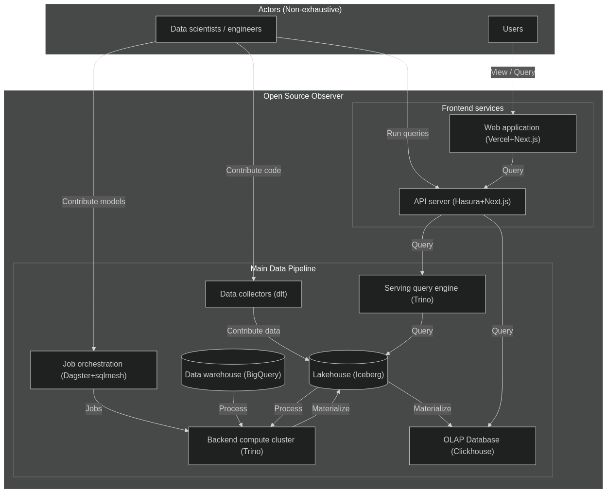
Here's where we ended up after a year of exploring DataOps tooling:
- For cloud infrastructure: Google Cloud
- For data orchestration: Dagster
- For data transformations: sqlmesh
- For data ingest: dlt
- For data lake tables: Apache Iceberg
- For OLAP database: Clickhouse
- For OLTP database: Supabase
- For GraphQL APIs: Hasura
- For low-code frontend builder: Plasmic
- For frontend framework: Next.js
- For frontend hosting: Vercel


